Summary
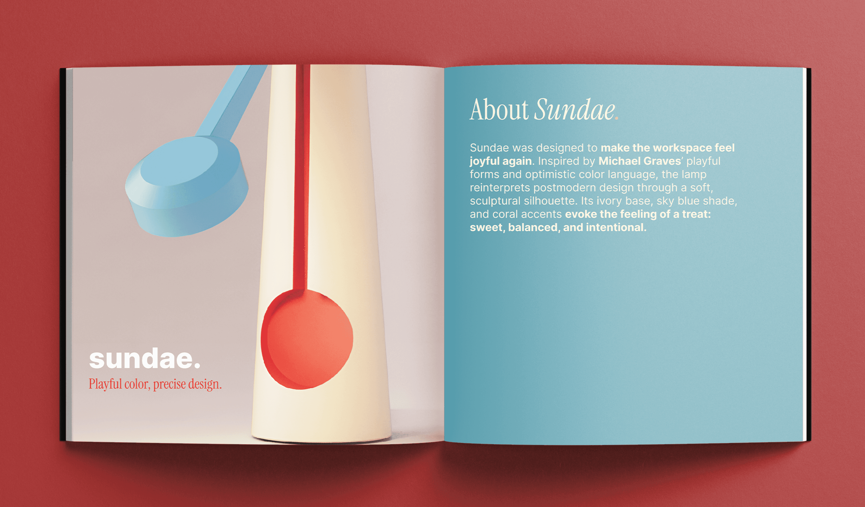
Inspired by Michael Graves’ playful forms and optimistic color language, Sundae was created to make the workspace feel joyful again.
Deliverables
Fully functional lamp, poster & brochure.
Fully functional lamp, posters & brochure.
Timeline
3 weeks
DESIGN CHALLENGE.
How might we translate the iconic, playful, human-centered design language of Michael Graves into a new lighting device?
RESEARCH.
Understanding Michael Graves
Understanding Michael Graves

Michael Graves was an American architect and designer who blended postmodern playfulness with everyday practicality. His products use bold geometric forms, approachable silhouettes, and friendly colors to make them feel delightful to use. Graves believed that good design should be intuitive, accessible, and joyful, turning simple household items into memorable experiences.
Michael Graves was an American architect and designer who blended postmodern playfulness with everyday practicality. His products use bold geometric forms, approachable silhouettes, and friendly colors to make them feel delightful to use. Graves believed that good design should be intuitive, accessible, and joyful, turning simple household items into memorable experiences.
Design Analysis
Design Analysis
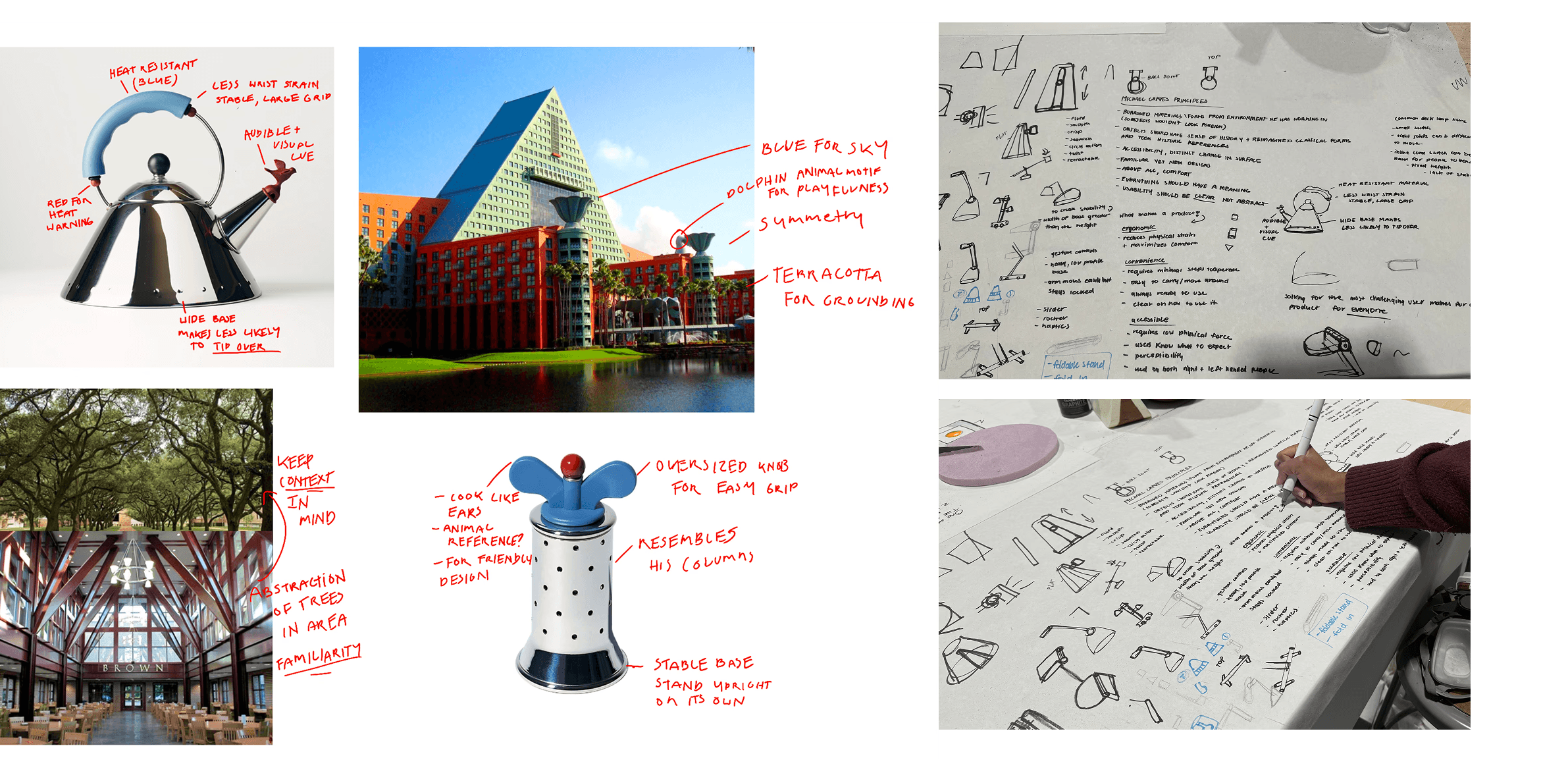
To get a deeper understanding of why he made his decisions, I broke down a few of his designs.
To get a deeper understanding of why he made his decisions, I broke down a few of his designs.
Guiding principles
Guiding principles
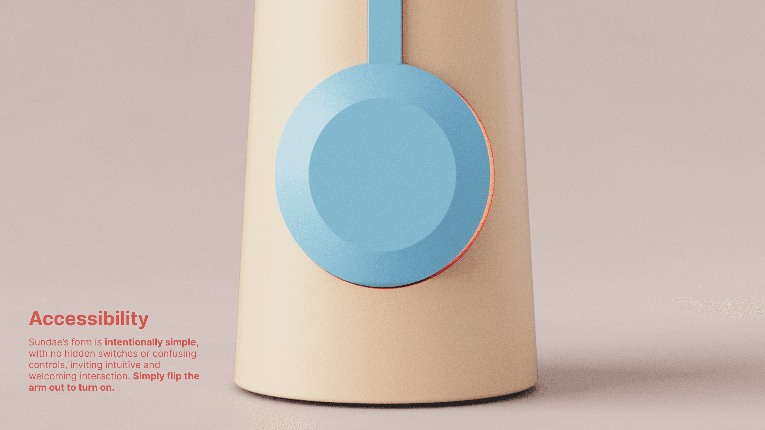
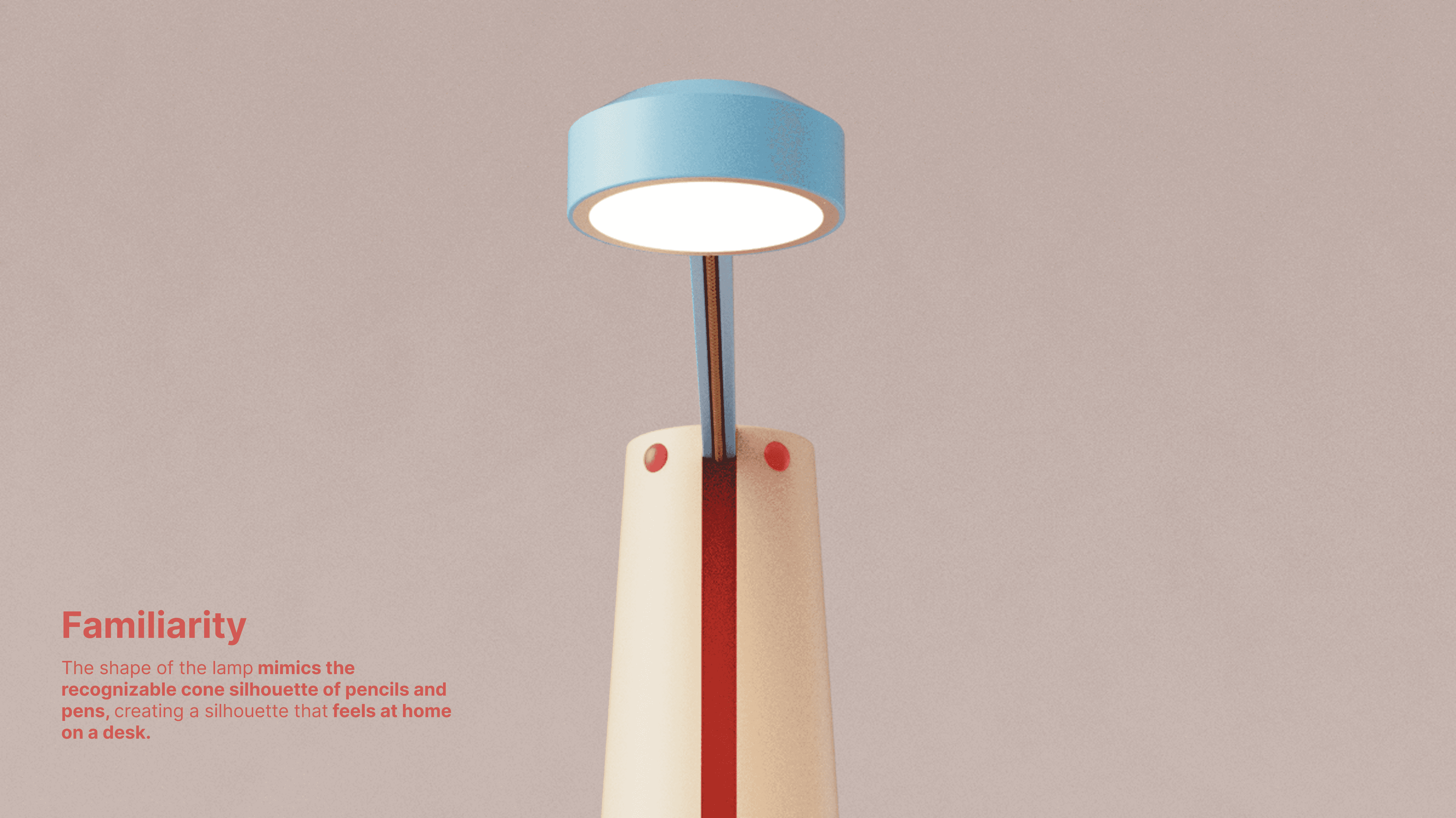
From the research, I determined 3 guiding principles:
From the research, I determined 3 guiding principles:

DESIGN.
Rapid Ideation
Rapid sketching allowed me to test ideas early, fail fast, and converge on the strongest directions.
Rapid sketching allowed me to test ideas early, fail fast, and converge on the strongest directions.

Exploring Form


Through prototyping, I identified an opportunity to merge the folding action of the first prototypes with the form of the second round.
Through prototyping, I identified an opportunity to merge the folding action of the first prototypes with the form of the second round.

Colored Touchpoints
Colored Touchpoints
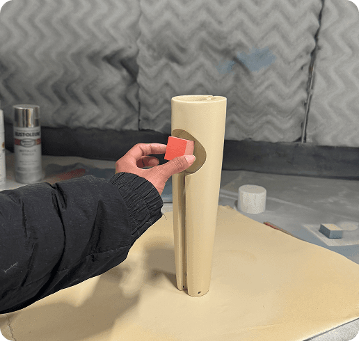
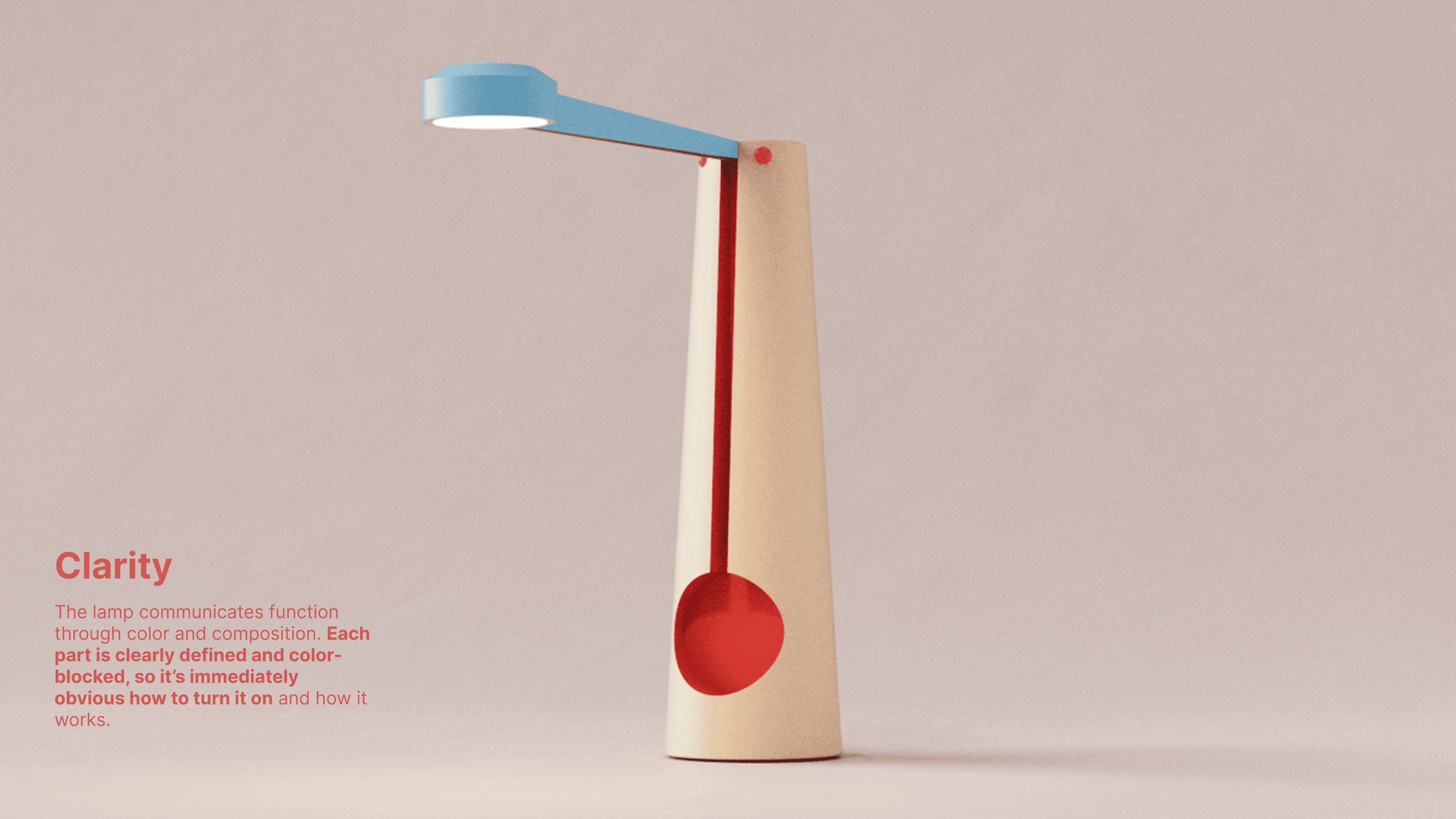
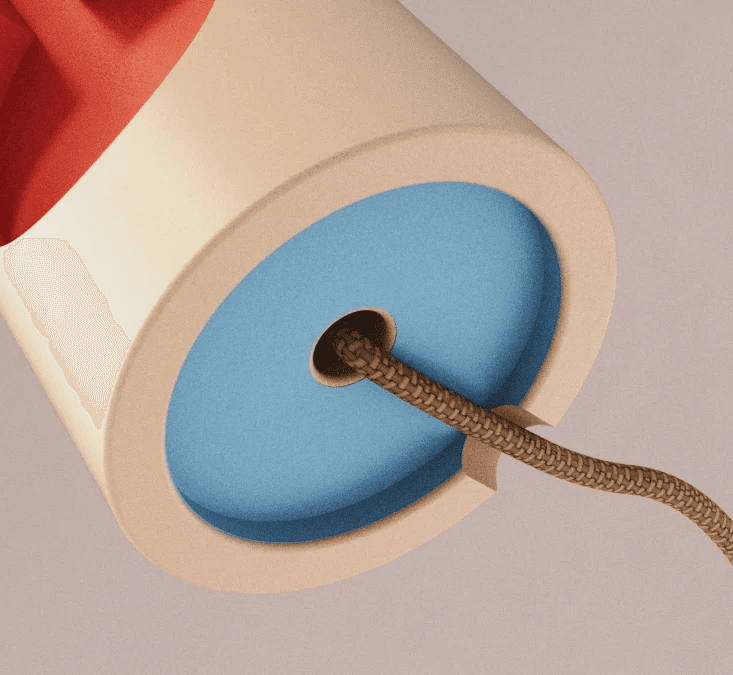
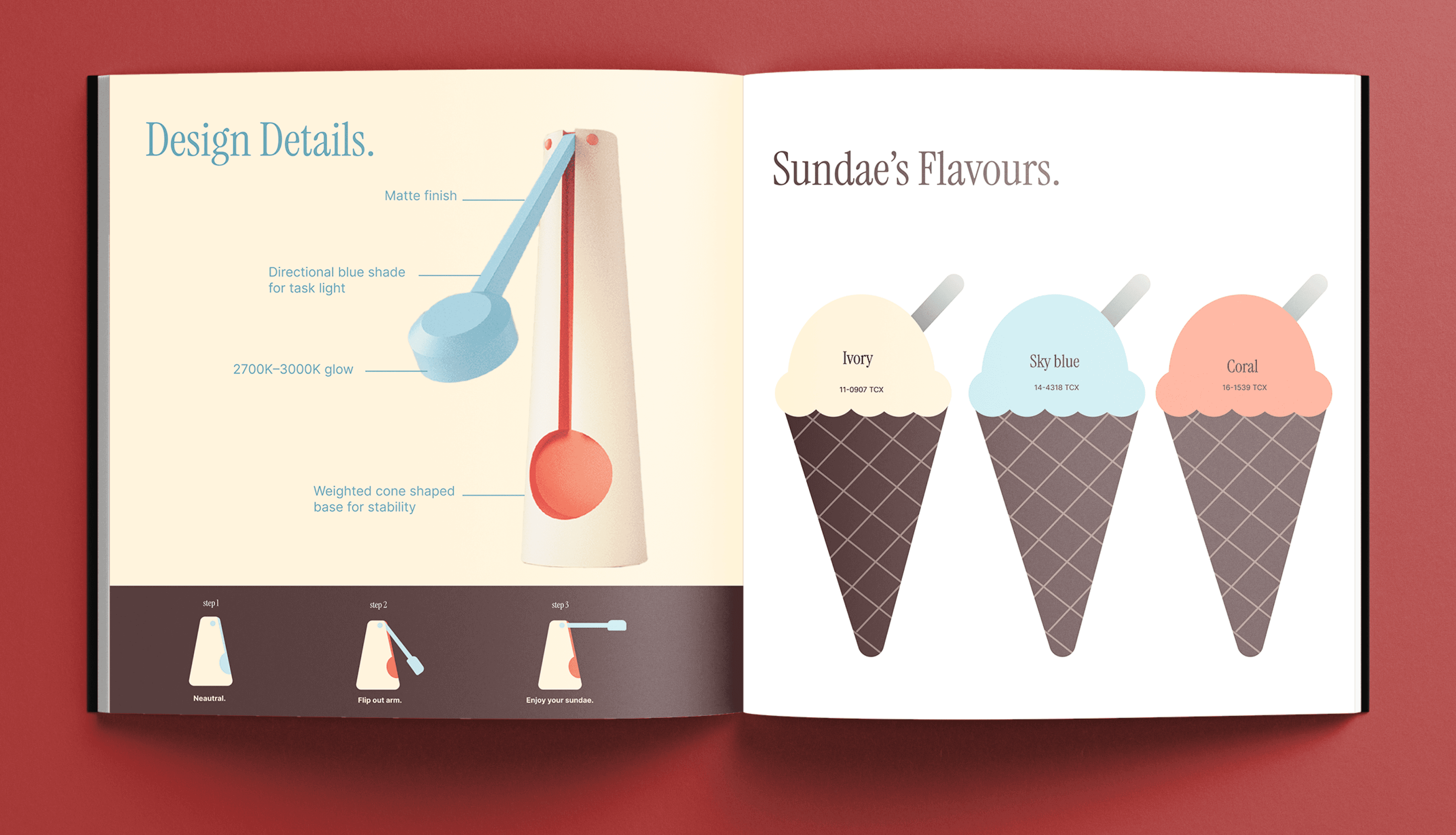
Color was essential to communicating interaction zones. The blue was on parts where you could visibly see the wire/where electricity flowed through. The coral was to indicate that the arm folds in, and the ivory was so that the other two colors could pop.
Much like Graves, I wanted to include color blocking, and assign each color to a meaning. The blue was on parts where you could visibly see the wire/where electricity flowed through. The coral was to indicate that the arm folds in, and the ivory was so that the other two colors could pop.

Understanding Engineering
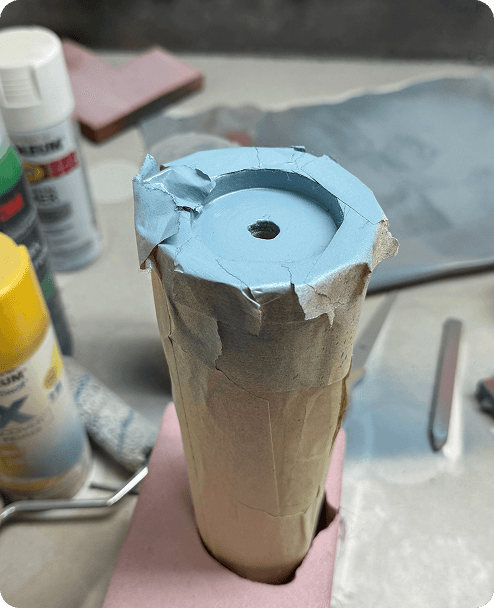
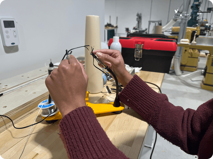
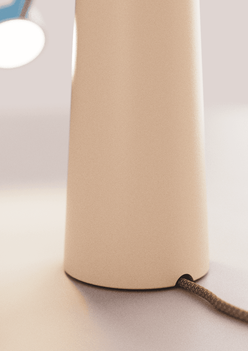
The structure was not hollow, so I cut the light puck wire, routed it through the body, and soldered it back together to maintain functionality. To support the weight of the moving arm, I used a torque hinge.
To support the weight of the moving hand, I decided to use a torque hinge. I cut the wire of the light puck I was using, put it through the structure, then soldered the two pieces back together.

Final
Final

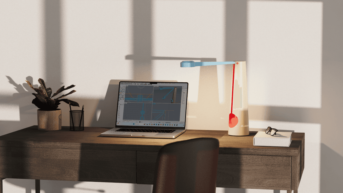
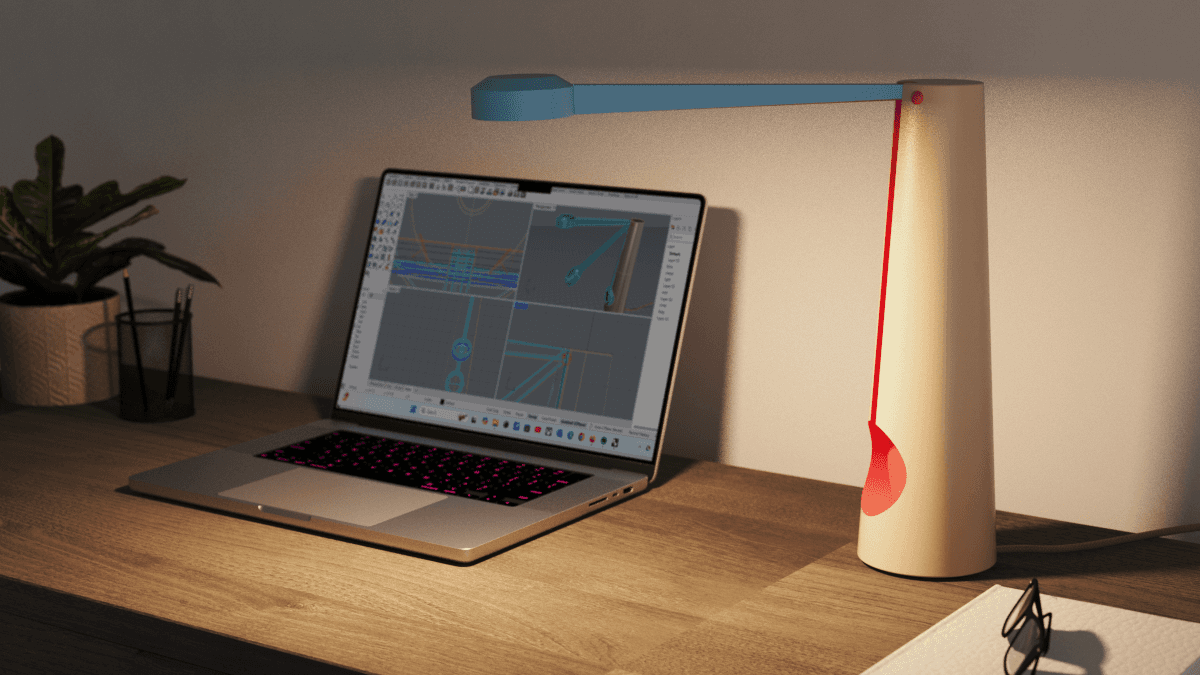
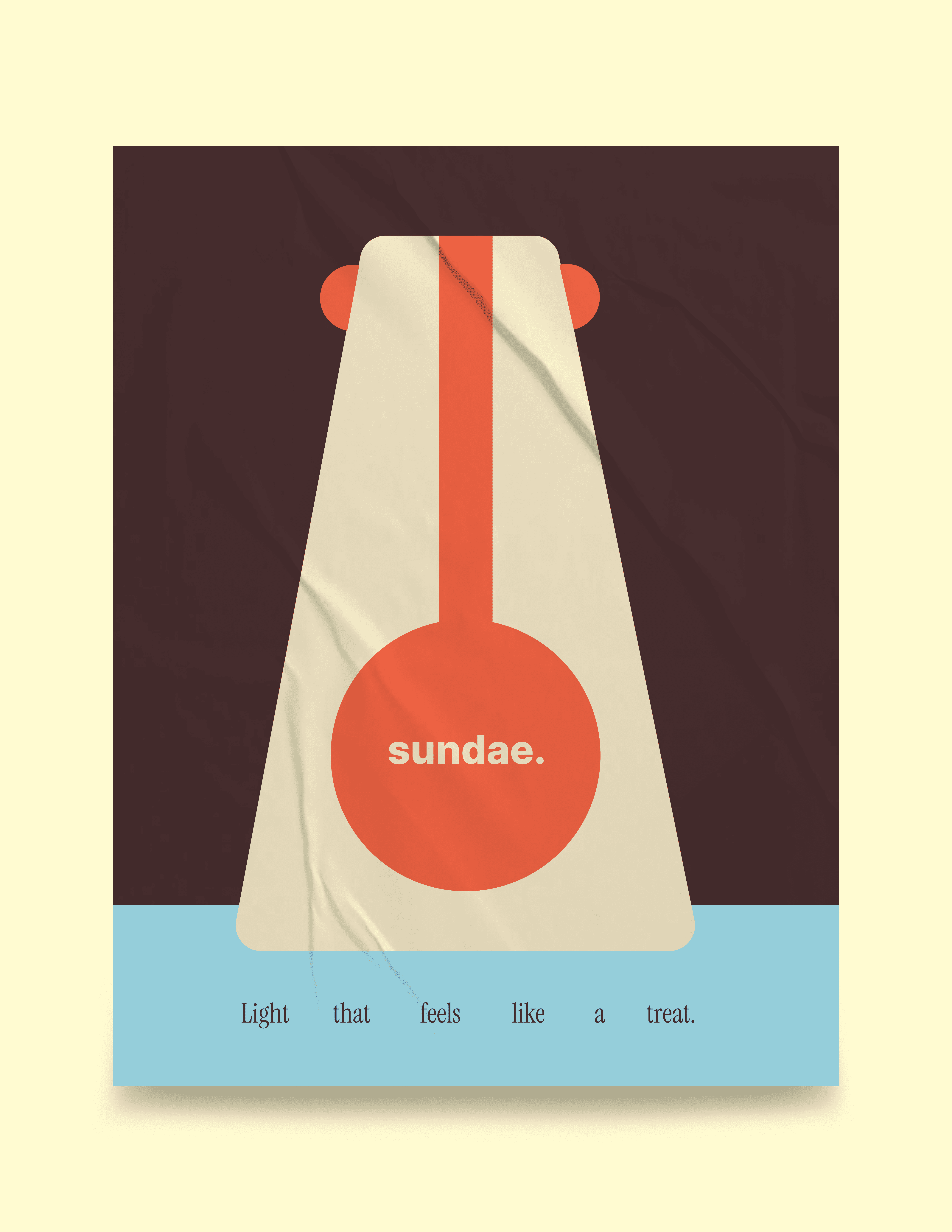
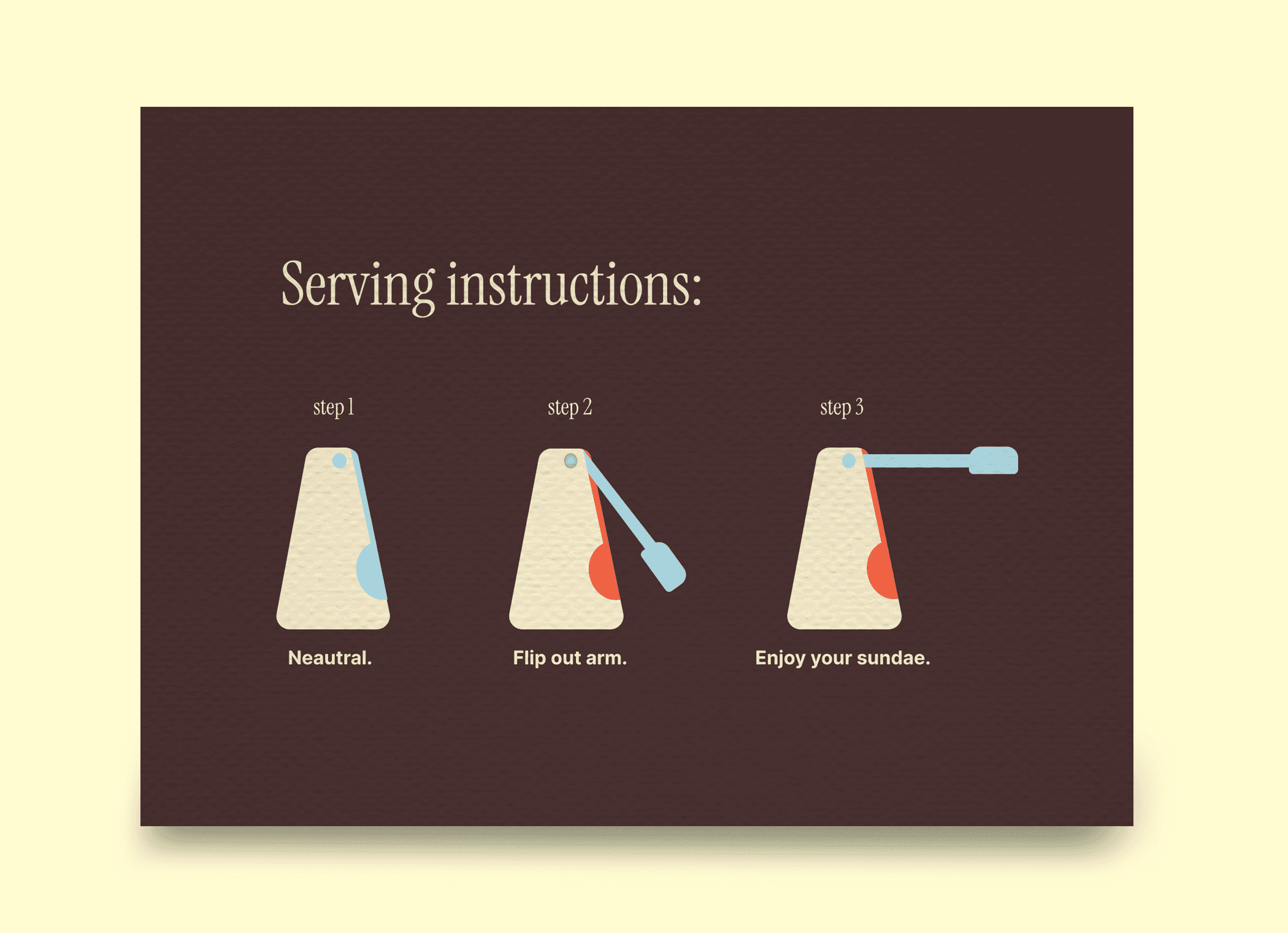
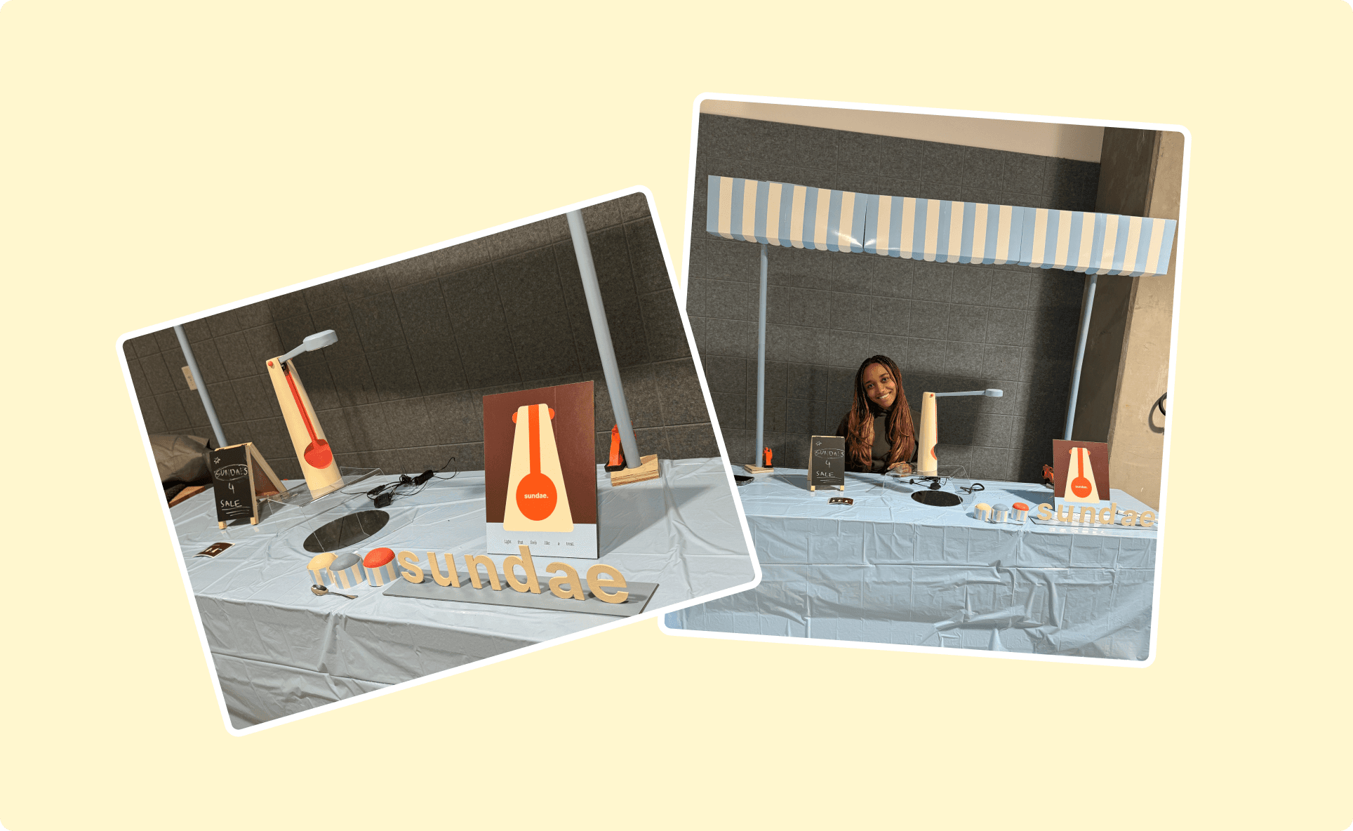
I created an ice cream themed booth to present the final piece!
I created an ice cream themed booth to present the final piece!
